
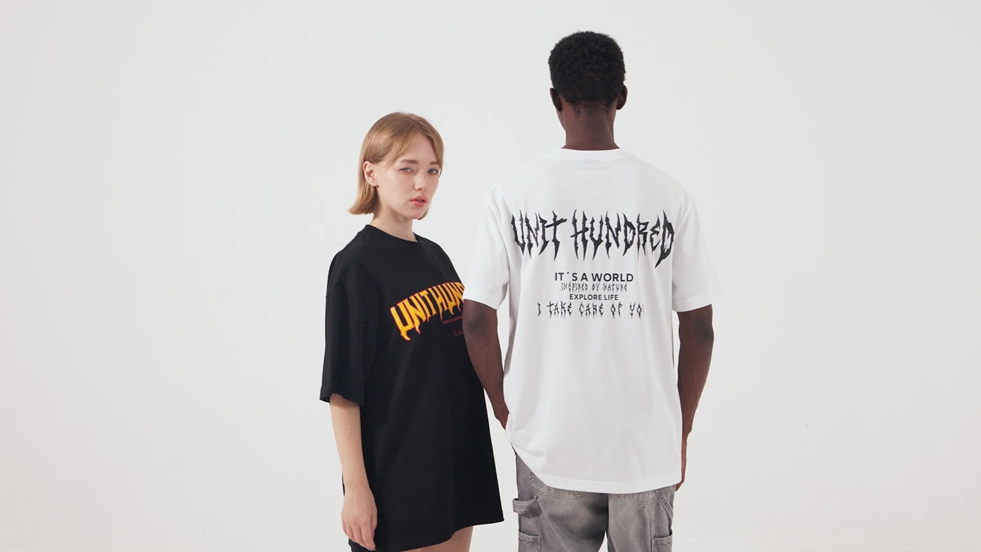
One of the most effective ways to grow a clothing line, foster solidarity at events, or market your company is to design a personalized T-shirt. But applying a logo on cotton isn't the only step in the process. Every decision you make, from fabric kind to design size, has an impact on the finished product's appearance and how your customers feel wearing it. Your brand's reputation could be harmed by a badly designed shirt that is uncomfortable, unattractive, or of poor quality. Conversely, a well-designed shirt becomes a favorite item that buyers wear repeatedly.
We'll go over all you need to know in this comprehensive tutorial to create a T-shirt that is eye-catching, cozy, long-lasting, and unforgettable. These procedures are predicated on years of clothing.
How to design a T-shirt in 6 steps?
Step 1: Define Your Purpose and Audience
Think about why you are making this shirt. Is it for a product launch, a limited-edition drop, a charity function, or just regular uniforms? Every design choice is based on the objective. A shirt for a business occasion could need a clean, professional look, whereas a streetwear drop should be vibrant and fashionable. Think about who will wear it once you know what it's for. Are they college students who like clothes that are too big, or professionals who want branding that isn't too obvious? Knowing who your audience is will help you avoid wasting designs.
 |
 |
 |
Step 2: Build a Strong Design Concept
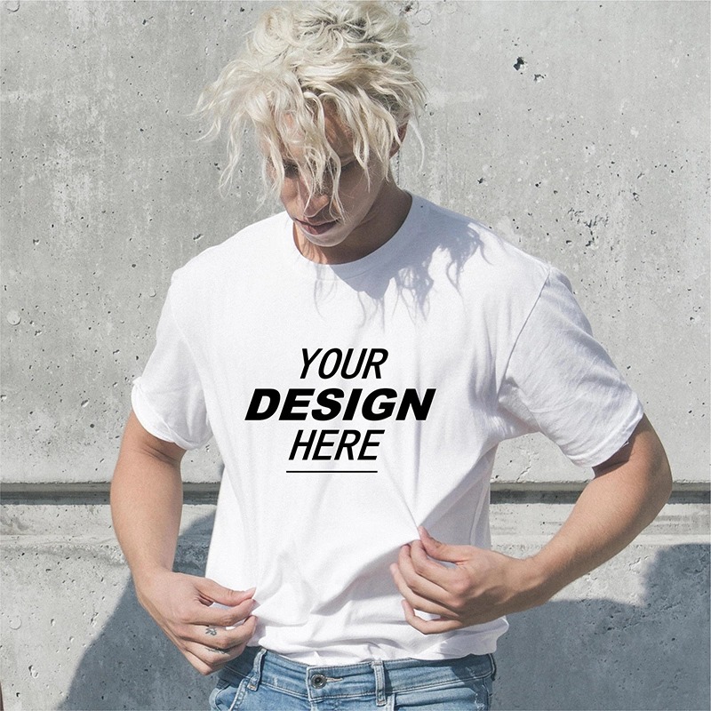
Your design idea should fit with the personality of your brand. Use mood boards, sketches, or digital drafts to get ideas. Think about how your brand colors, phrase, or emblem can be used. Remember that less is often more. Simple, bold patterns are easier to remember and print well. Don't put too many things on the shirt so it gets too crowded. A simple, clear layout with only one great visual or line of text is often better than one that is complicated an understand.
 |
 |
Step 3: Learn how to use colors, fonts, and layout.
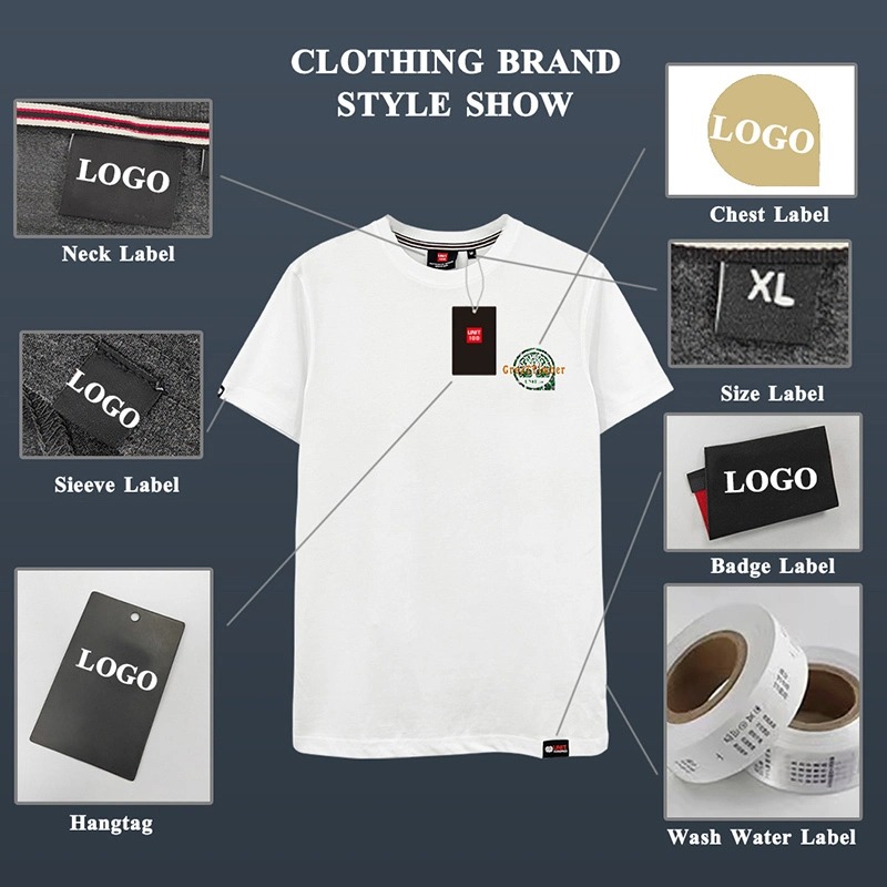
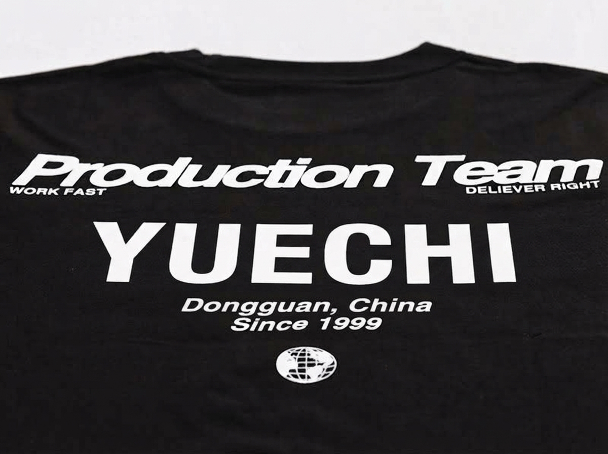
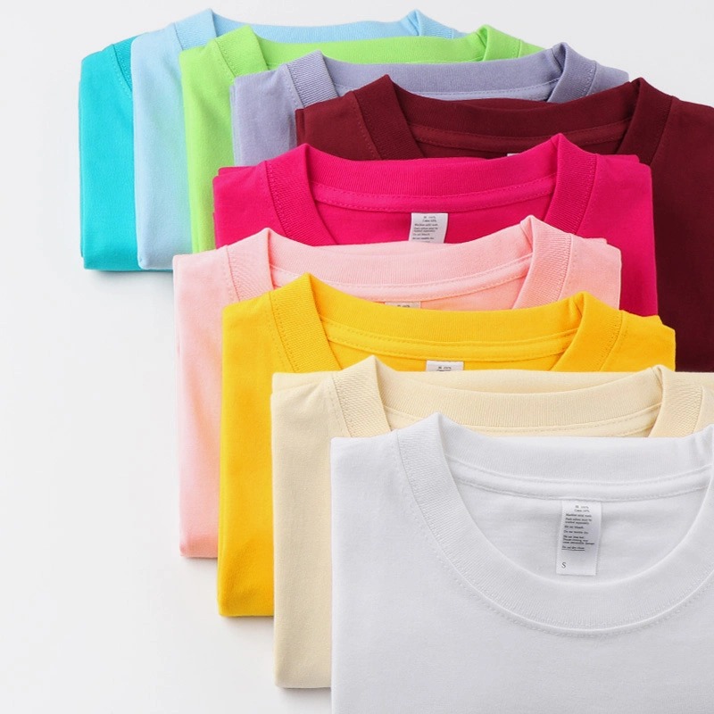
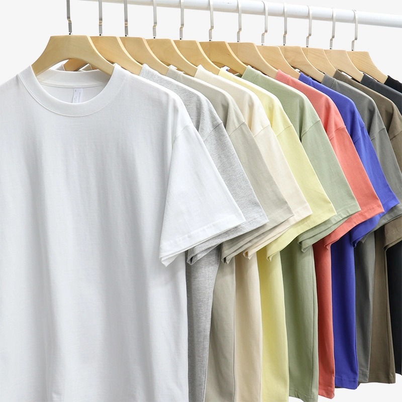
Choosing the right color is really important. A black T-shirt with a neon logo gives off a very different vibe than a pastel tee with white text that is not too bright. Colors not only affect how things look, but they also affect how we feel. For example, reds make us feel active, blues make us feel tranquil, and greens make us feel eco-friendly. It should be easy to read fonts from a distance. Slogans look good in bold sans-serif fonts, and more styled typefaces can add a fashion edge. Deciding where to put a logo - on the chest, sleeve, or back - affects how well it can be seen and how much of an impact it has.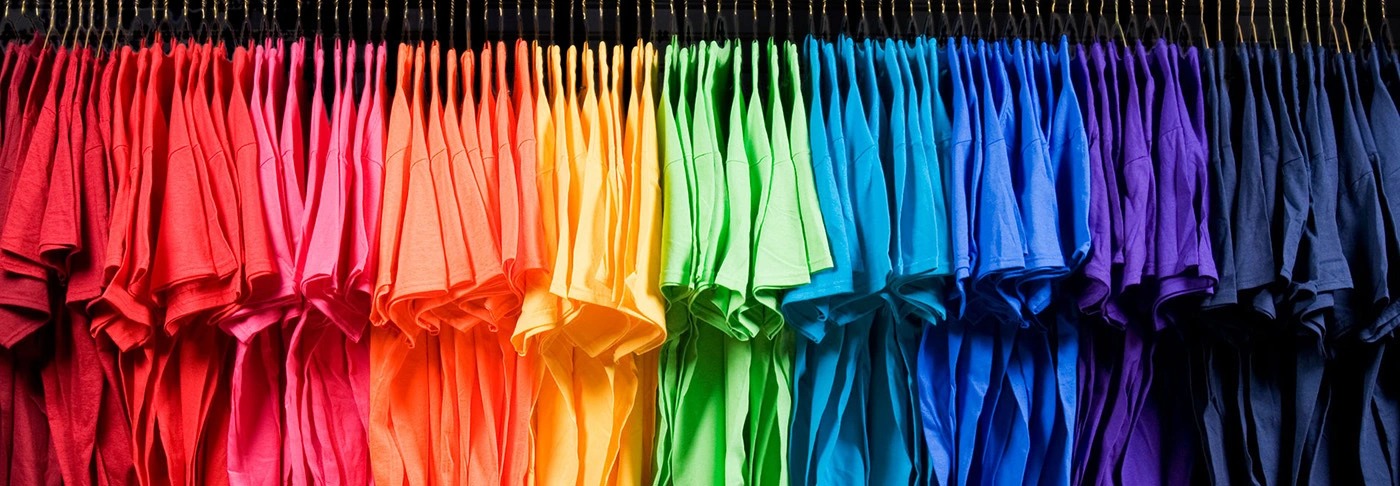
 |
 |
Step 4: Get the files ready and choose how to print them
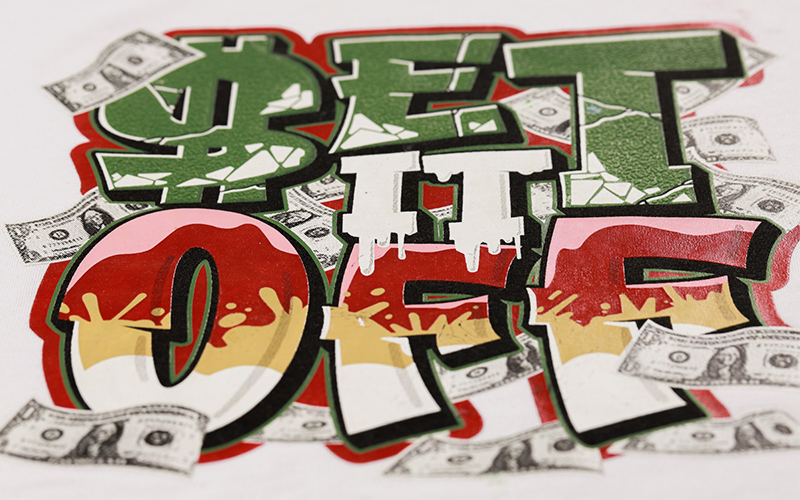
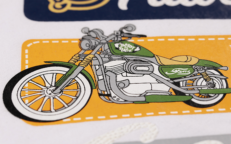
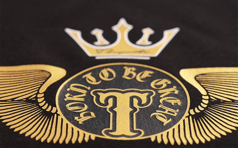
Professional printing depends on having good design files. Always send high-resolution artwork. Vector files like AI or EPS are preferred, but 300 dpi PNGs will work too. Check with your printer to see what color format they need. Some need CMYK, while others need Pantone to get the colors right. There are also good and bad things about different ways of printing. Screen printing makes bright, long-lasting prints for big designs, but it might not work as well for little gradients. Direct-to-garment (DTG) printing can print in full color, but it works best on 100% cotton. Logos that are embroidered look nicer, but they cost more. Choose a method that fits your design and budget.
 |
 |
 |
 |
 |
 |
● Printing fuzzy pictures from low-resolution files.
● Selecting fabric that doesn't fit the function, like heavy cotton for summer uniforms.
● Designs that are too complicated and lose detail when printed.
● Not paying attention to how things fit and shrink after washing.
● Making decisions rapidly without verifying the proofs.

